Blog
The Behavioral Science Behind Easier Digital Payments
How do people really experience digital payments in low-trust, low-connectivity environments? We dig into the behavioral and contextual challenges that shape adoption, and what designers can do to create smoother, safer payment journeys.

Picture this: you’re completing an online payment, carefully filling out all the details, and you tap the Pay button. Easy, right? But now think of Amir, a young man from a remote village in Pakistan, where mobile internet is a recent but unreliable luxury. He’s the first person in his family to own a smartphone, and he’s still learning how to use it. The mobile money service he uses to send money to his family has a mobile app and he decides to give it a try. Previously, he always relied on mobile money agents and now that he’s sending money himself, he’s anxious about making mistakes, or worse, losing money. He double-checks to ensure he’s entered all the numbers correctly. As he progresses through the steps, tapping the Next button, the slow internet causes a lag. He taps it again, but accidentally hits the Pay button, which is located in the same spot on the next screen, missing his chance to confirm the details. The screen changes again, and he’s unsure if the payment went through correctly. His heart races and his stress levels spike. What can he do now?
Moments like this highlight the gaps that exist between design and user expectations. Depending on your experience and access to digital financial services, you may or may not relate to the scenario above. Still, it exemplifies hurdles that can discourage new users and sometimes even exclude people from adopting new technologies. If we understand the behavioral nuances of how users interact with products, we can bridge such gaps by making informed design decisions.
Designing based on best practices can be effective, but only if those practices are tested and validated in a similar context. Applying established design principles to a different context requires adapting them to address contextual challenges to optimize usability. Users have different levels of knowledge, skills, experience, and expectations when using products and features. What is intuitive in one context may be confusing in another. It’s up to designers to ensure that tech is user-friendly for its target audience, guiding them in using the solution for its intended purpose.
Building Through Behavior
Behavior is heavily influenced by the environments we live in and the people we surround ourselves with. So if we want to design products to help people change their behavior, doing research locally is key. We need to understand the mechanisms behind our audience’s behavior within their specific context. What are their goals, and what obstacles do they experience? What drives their motivations and worries? Conducting both quantitative and qualitative research allows us to gain insights into the mechanisms of behavior and the existing mental models that shape how people interpret and interact with products and services currently. This forms the foundation upon which we build our designs. Without this contextual understanding at the core, even the most aesthetically appealing products will likely miss their mark.
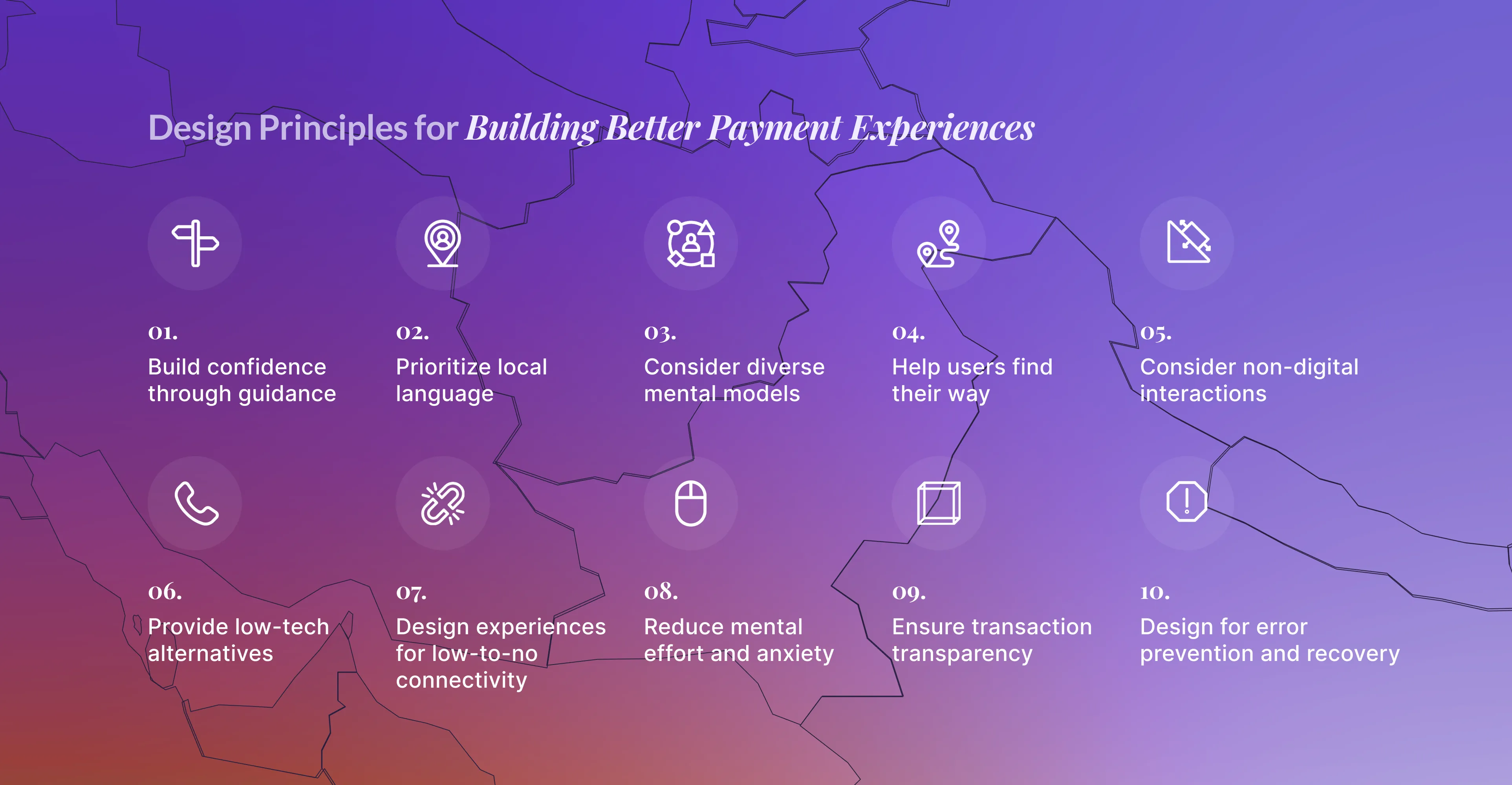
The scenario we described in the introduction shows how new digital experiences can be stressful if the design isn’t optimally tailored to its users’ skills and expectations. The UX Principles we’ve identified tap into behavioral mechanisms in user-product interaction. Here, we’ll elaborate on the practical implementation of some of these mechanisms.
Unpacking Mental Models
Mental models act as our internal maps for navigating and interacting with interfaces. Based on previous knowledge and experience, these models help us predict how a product or service will work, influencing our behavior accordingly. Since each person has unique experiences and skills, someone else’s mental model might differ from yours. Designing digital interfaces, or any product for that matter, comes with the challenge of ensuring clarity so users can easily understand how to engage with it. What seems intuitive to us as designers might not be as clear to everyone else, and this mismatch can impair usability. By understanding users' existing mental models, you can guide your design to make the product or interface feel intuitive, and providing clear examples and explanations can further shape their mental models.

An example is the shopping cart or basket many online stores have adopted. When you buy products in a store, you take a cart to carry around the items you wish to buy, until you pay for them at the cashier. But online shopping doesn’t work in the same way. You can select the products you wish to purchase, but you don’t have to carry them around – so where do you leave them? To match the experience with the familiar experience of physical shopping, most online stores use a virtual shopping cart or basket as a digital representation of collecting items in one place as they go through the online store. This aligns the digital experience and expectations with what people are already familiar with, shaping their mental model for how to navigate the online shop.
Example: Udhari as a Social Norm
When it comes to our fintech solution, mental models can inform features like payment requests or loan repayments. In Pakistan, payment agreements called “Udhari” are common social norms. An informal version of ‘Buy Now Pay Later’, Udhari relies on personal relationships and trust within communities. By leveraging such existing behaviors, we created digital alternatives for offline practices that people are already familiar with. This shows how an understanding of socio-cultural norms and practices can inform contextually relevant customization of digital features, such as scheduled payment requests for later to allow for ‘digital Udhari’. To support cash-reliant users in adopting digital financial services, designing for their existing mental models can help smoothen the transition.

Mitigating Failure States
Another design principle involves proactively mitigating possible failure states. When you’re designing a product intended for regular use, it requires multiple repetitions of usage for it to become a regular practice. If new users run into issues and drop off before they reach this stage, they may abandon the product altogether. To overcome this, it’s important to design for both prevention and recovery. Potential or common failures should be identified proactively, informing design decisions to decrease the likelihood of these errors occurring in the first place. And even then, recovery features should be integrated, providing users with easy ways to undo or correct unwanted actions. Ideally, feedback loops should be set up to ensure that users receive immediate feedback on their actions. This can help them understand the consequences of actions in real-time, allowing for quick adjustments and learning how to use the features over time.
Managing finances can be a sensitive topic, and many people are loss-averse when it comes to money. In Pakistan, the vast majority of the unbanked population belongs to lower socio-economic classes, making them even more prone to anxiety around monetary interactions and digital transactions. Any mistakes and financial losses can have an immediate adverse impact on their lives, heightening the importance of designing to build trust and to prevent confusion and errors.
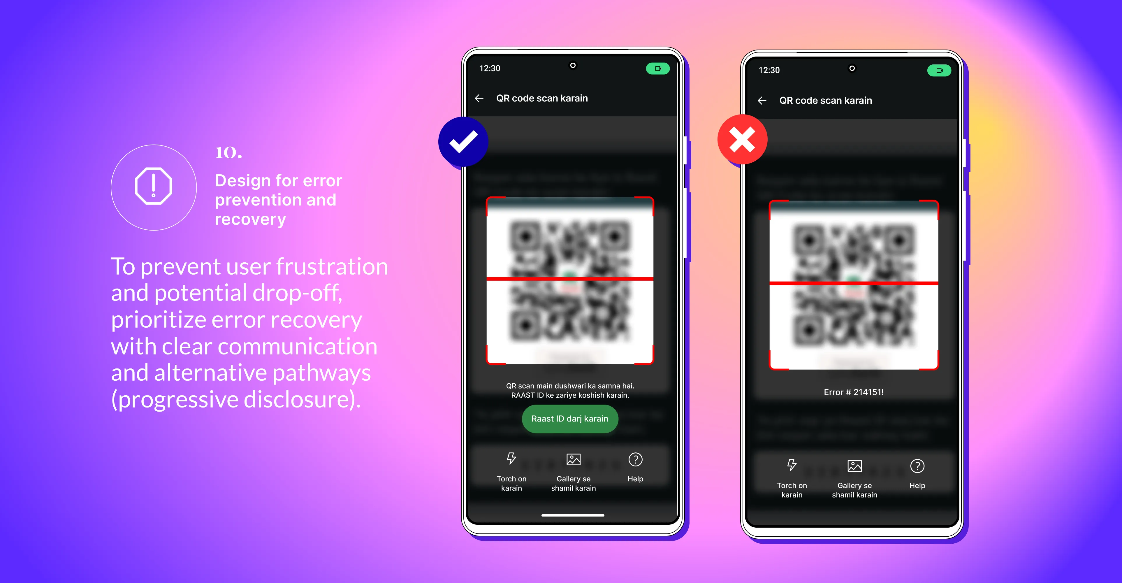
Example: QR code Issues
An illustration of mitigating failure states is the design of QR codes to make payments. QR codes placed at payment counters are common practice in Pakistan. These payment counters can be experienced as fast-moving, high-stress contexts: you have the pressure of the queue behind you, urging you to finish your transaction quickly. When designing QR payment experiences for new users, we learned that users would abandon a payment if an error occurred, such as failure to scan due to technical issues with a customer’s phone or because of a dirty or damaged payment QR sticker in a shop. Instead, they would fall back on using cash or come back to the store later. In that stressful scenario, they did not feel comfortable figuring out an alternative in the digital system.
As a solution, we added explanations for what was causing the errors and guided users to possible digital alternatives to restore user confidence and help them regain control of the situation. This decreased their anxiety and reduced the chances of users abandoning the digital payment altogether.
Trust, Transparency & Perceived System Efficacy
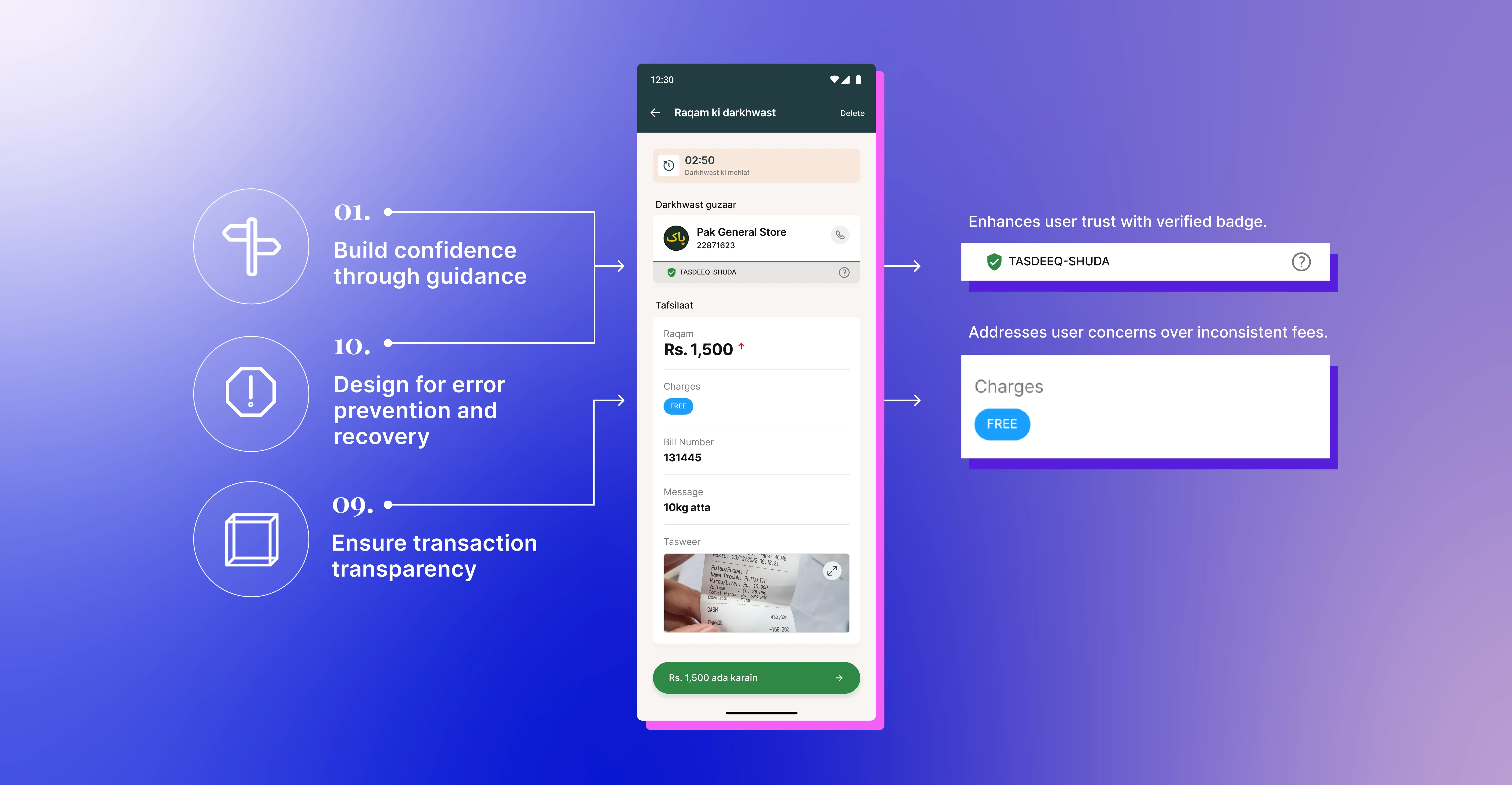
For users to feel confident using a financial product, they must believe that the system is reliable, secure, and effective. Building trust and perceived system efficacy is therefore crucial to ensure successful adoption and sustained use. Equally important is transparency in transactions. Users should see and understand the process initiated by their actions, how their money is being managed, and where it is going. Clear communication and guidance about these aspects help demystify the process, reassuring users of the system’s integrity and reliability, and making people feel that their finances are safe.
Example: Visual Cues for Verified Merchants & Free Transactions
When designing digital payments for merchants, one of our recommendations was to add visual cues to build trust by indicating that the money is being sent to a reliable party (i.e., a reputable, traceable entity). By consistently placing these cues across different contexts, users can learn to associate this element with trust. This allows them to feel more confident when making payments to merchants and wary when it is not present, thereby reinforcing trust in the system. We also discovered that users got agitated by inconsistent and unexpected fees for various digital transactions. To solve that, possible transaction fees are now more clearly indicated upfront to ensure transparency across the journey.
Over time, the consistent presence of these visual cues can make users more comfortable with completing digital transactions. And as their newly formed expectations align with their new experiences, their mental models for these digital payments are shaped and strengthened along the way.
Key Takeaways
By understanding the underlying mechanisms that drive user behavior, designers can create intuitive, accessible, and delightful digital experiences for diverse user groups. The case of designing digital financial services in Pakistan underscores how contextual research and behavioral insights can bridge gaps between user expectations and product design to create digital interfaces that promote financial inclusion.
To summarize the key strategies highlighted above:
Conduct Research Locally: Engage with your audience through both quantitative and qualitative research to gain insights into their audience’s needs, challenges, and current behaviors. This will help you tailor your designs to fit the local context.
Understand and Align with Existing Mental Models: Conduct research on your audience's existing mental models so your designs can match those, ensuring an intuitive digital experience.
Mitigate Failure States: Proactively identify potential points of failure and design solutions to prevent or overcome common errors. Integrate feedback loops and recovery features to help users learn and allow them to adjust their actions in real-time.
Build Trust and Transparency: Show users where their money is going and how transactions are managed. Use consistent visual cues to reinforce security and trust. This helps in building user confidence and perceived system efficacy over time.